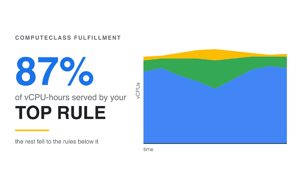
A ComputeClass is a ranked list of capacity preferences: try this shape first, fall back
to that one. GKE numbers those rules from zero, so your top choice is “rule 0” — and the
ccc_priority_index node annotation records which rule actually won each node. Aggregate
it over time and you can finally answer the question the per-node view can’t: how much of
the capacity you got came from your first choice? Here’s a working exporter, a Cloud
Monitoring dashboard, and an argument about what “volume” should mean on that chart.
In the last post I walked through the
observability surface GKE 1.36.4 added to ComputeClasses, and spent a while on the node
annotation ccc_priority_index — the field that finally tells you which priority rule
provisioned a given node, instead of making you infer it from machine shapes.
Quick refresher, because everything below hangs on it. A ComputeClass is an ordered list:
the first rule is the shape you actually want, the next is what you’ll accept if the first
isn’t available, and so on down. GKE numbers them from zero and stamps each node with the
index of the rule that won it. So ccc_priority_index: "0" means you got your top choice.
Anything higher means you fell back. I’ll say “rule 0” and “your top rule”
interchangeably from here.
That’s a per-node answer. It’s the right answer when you’re mid-incident with a node in front of you. But almost everyone I’ve shown it to immediately asks a different question, and it’s the better one:
Over the last week, how much of what this class gave me came from my top rule?
That’s not a debugging question. That’s a design review question. You ranked your
capacity preferences in a specific order and told GKE to honor them. Did it? If your
first-choice rule is quietly failing 40% of the time and rule 2 is carrying the cluster, your class is not describing reality, and nothing in kubectl get computeclass
will ever tell you — it only reports right now, and right now is almost never when the
interesting thing happened.
So let’s build the thing that answers it. This is where we end up — every ComputeClass in every cluster, scored on how much of its capacity came from the rule you actually wanted:
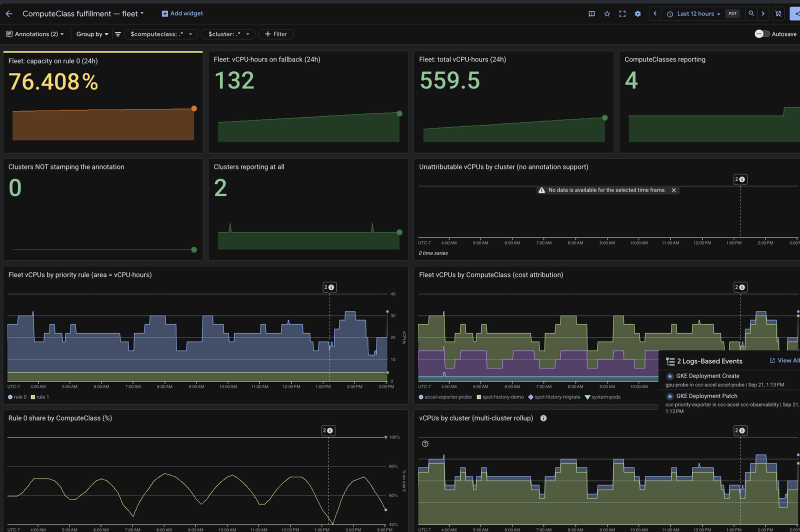
Scorecards across the top, capacity composition over time below them, and the same data as a percentage at the bottom — plus vertical markers where GKE deployment events landed, so a change in the shape of the chart can be lined up against the change that caused it. Everything on it comes from one exporter reading one node annotation.
The number to read first is top-left, with the two tiles underneath that tell you whether to believe it:
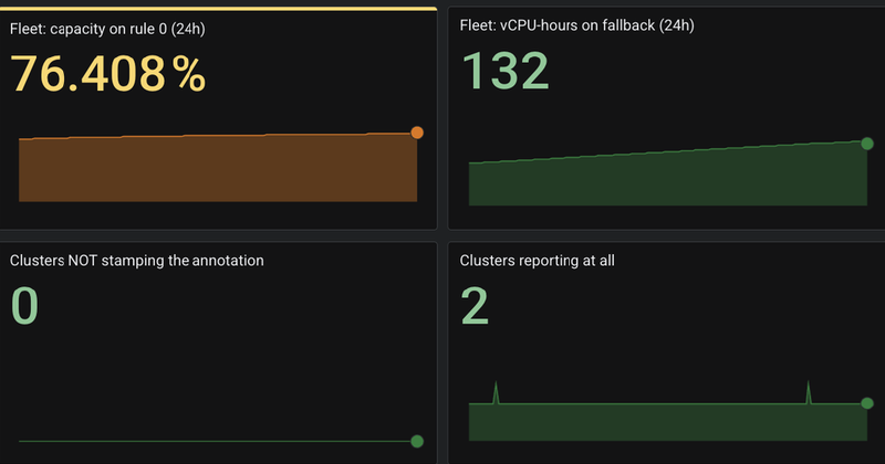
76% on rule 0. Which is either fine or alarming depending on what you thought you’d ranked, and that is exactly the point — before this chart existed there was no number there at all. The two tiles underneath are what keep it honest: if a cluster isn’t stamping the annotation, it says so, rather than letting a silent zero read as “nothing fell back.”
One thing up front, because it changes who this post is for: this needs only GKE 1.33.
The status surface in the last post needs 1.36.4, but this dashboard reads nothing except
the node annotation, and I bisected that across live clusters — absent on 1.31.14 and
1.32.13, present on 1.33.13 and every version after. 1.33 sits at or below the minimum
version of every active release channel, so the usual and entirely fair objection —
“sounds great, we’re two minors behind and nobody is upgrading the fleet this quarter” —
doesn’t land here. You can stand this up this afternoon without touching a control plane
version. (The newer priorityScore field does need 1.35.2+. That’s part of why I built
this on the annotation instead.)
Why vCPU, and what “volume” should mean#
Before the manifests, the measurement decision — because this is the part that determines whether the chart tells you the truth.
The natural metric is nodes provisioned per rule, and it’s misleading the moment your
priority rules provision different machine shapes. Which is the normal case; it’s most of
the reason you wrote a multi-rule class. Consider a class that prefers c3 and falls back
to e2. It reports a tidy 50/50 node split. But if the c3 rule is producing
c3-standard-4 and the fallback is producing e2-standard-16, then the “50%” fallback is
carrying four times the compute of your preferred rule. Node count answers how many
times. It does not answer how much.
So the unit I’d argue for is vCPU-time, and the presentation that makes it readable is a stacked area chart of vCPUs by priority rule over time.
The reason to prefer that specific chart is that it does double duty. Read it at any instant and you get the current composition of the fleet. Read the area under each band and you get vCPU-hours — because that’s literally what the integral of “vCPUs running” over time is. Volume falls out of the chart geometry instead of needing a separate calculation, and it’s duration-weighted for free: a fallback node that lived for six hours registers as six times the failure of one that lived for one. A bar chart of provisioning events treats those identically, which is how you end up chasing a brief 3 a.m. blip while a permanent fallback band goes unnoticed.
Then normalize it. The number that belongs in a review isn’t “1,840 vCPU-hours,” it’s “93% of our capacity came from rule 0 this week” — a percentage is comparable across weeks and across classes of wildly different sizes, and it’s the form the question was asked in.
I’d keep event counts, though, as a secondary metric rather than the headline. “How much capacity came from the fallback” and “how many times did we have to fall back” are genuinely different questions, and the second one is the one that tells you whether you’re looking at a steady shortfall or a thrashing autoscaler. So the exporter emits both, and the dashboard shows both — just not in the same tile, and not with the event count on top.
Accelerator fleets: count chips, not vCPU#
That argument has a limit, and it’s why the repo ships three fleet dashboards instead of one.
vCPU-time is the right common scale for CPU fleets, where a rule’s capacity and its cost
both track roughly with core count. On an accelerator class that stops being true. Two
rules can deliver the same vCPU count while delivering a completely different number of
chips, and the chips are the line item. A class that prefers a3-highgpu-8g and falls
back to a two-GPU shape has not lost 0% of its capacity when the vCPU chart looks flat —
it has lost three-quarters of its GPUs. Measuring that fleet in vCPU produces a
confidently wrong number.
So the exporter also emits ccc_accelerators_by_priority, labelled by resource name
(nvidia.com/gpu, google.com/tpu), and emits it only for rules actually running
accelerators, so a CPU-only fleet never sees the series at all.
Those live on separate dashboards rather than as extra charts on one, because they’re
different scales and can’t share an axis or a total. Stack vCPUs and GPU chips together
and you get a number in no unit at all; normalize them against each other and you get a
percentage that means nothing. “78% of our vCPU-hours came from rule 0” and “78% of our
GPU chip-hours came from rule 0” are both useful sentences. Their average is not
a sentence. So dashboard-fleet.json counts vCPU, and the -gpu and -tpu variants are
the same layout and the same queries with the capacity metric and every axis label
swapped — generated from the vCPU one by a script, so the three can’t drift apart.
The exporter#
It’s about 120 lines of standard-library Python with no dependencies, and it needs exactly
one permission: read-only on nodes. It polls the node API every 10 seconds, finds
every node carrying the cloud.google.com/compute-class label, reads the annotation, and
emits six metrics.
for node in self.fetch():
    meta = node.get("metadata", {})
    compute_class = meta.get("labels", {}).get(CLASS_LABEL)
    if not compute_class:
        continue  # not provisioned by a ComputeClass
    priority = meta.get("annotations", {}).get(PRIORITY_ANNOTATION) or PENDING
    key = (compute_class, priority, classify(priority))
    nodes[key] += 1
vcpus[key] += _quantity(node.get("status", {}).get("capacity", {}).get("cpu"))| Metric | Type | Meaning |
|---|---|---|
ccc_vcpus_by_priority | gauge | vCPUs running on each rule. Area under the stack = vCPU-hours. |
ccc_accelerators_by_priority | gauge | Chips running on each rule, labelled accelerator. Absent on CPU-only fleets. |
ccc_node_provisions_total | counter | Nodes provisioned per rule, deduplicated by node UID. |
ccc_nodes_by_priority | gauge | Raw node count per rule. |
ccc_priority_annotation_supported | gauge | 1 if this cluster stamps the annotation, 0 if not, absent if no node is old enough to say. |
ccc_exporter_up | gauge | 1 when the last poll succeeded. |
Two details in there are load-bearing.
Nodes in the annotation window get their own band, not rule 0. GKE stamps
ccc_priority_index a beat after the node object exists — about a minute, measured; see
Sharp edges — so there is always a moment when a live, pod-running node
has no priority index. The tempting shortcut, treating a missing annotation as “probably
rule 0,” would overstate your fulfillment rate on every single scale-up, and it
would do it invisibly. These nodes land in a pending_annotation band instead. The share
tiles filter it out entirely (kind="rule"), so the annotation lag is never scored for or
against any rule, while the absolute vCPU chart still shows it, because it is real
capacity you are really paying for.
The counter deduplicates by node UID, and seeds on first poll. UID dedup means a node is counted once no matter how many times it’s re-read or re-annotated — which is exactly what sank the approach I tried first. Seeding handles the subtler problem:
uid = meta.get("uid")
if uid and uid not in self._counted and priority != PENDING:
    # On the first poll we only record which nodes already exist; counting
    # them would turn an exporter restart into a burst of fake provisions.
    self._counted[uid] = True
    if self._seeded:
        counts[(compute_class, priority)] += 1
Without those four lines, every rollout of the exporter would inject a spike of fabricated provisioning events equal to your current node count — and it would look exactly like a real scale-up event.
Deploying it needs no image build and no registry; the script is mounted from a ConfigMap
into a stock python:3.12-slim:
kubectl apply -f exporter.yaml
kubectl -n ccc-observability rollout status deploy/ccc-priority-exporter
A PodMonitoring resource hands it to Google Managed Prometheus, which is already running
on your cluster if you’re on Autopilot or a recent Standard cluster:
apiVersion: monitoring.googleapis.com/v1
kind: PodMonitoring
metadata:
  name: ccc-priority-exporter
  namespace: ccc-observability
spec:
  selector:
    matchLabels:
      app: ccc-priority-exporter
  endpoints:
    - port: metrics
      interval: 30s
Within a minute or two the series show up in Cloud Monitoring with computeclass,
priority, and kind labels intact:
ccc_vcpus_by_priority{computeclass="priority-demo",priority="0",kind="rule"} 16
ccc_vcpus_by_priority{computeclass="priority-demo",priority="1",kind="rule"} 8
ccc_nodes_by_priority{computeclass="priority-demo",priority="0",kind="rule"} 4
ccc_nodes_by_priority{computeclass="priority-demo",priority="1",kind="rule"} 2
The queries#
The headline number is the share of attributable vCPU-time served by rule 0:
100 * sum(sum_over_time(ccc_vcpus_by_priority{kind="rule",priority="0"}[24h]))
    / sum(sum_over_time(ccc_vcpus_by_priority{kind="rule"}[24h]))
It’s a ratio of two sum_over_times, which is a nice property: the scrape interval
appears in both the numerator and denominator and cancels out, so the number stays honest
even if you retune the scrape or the series has gaps.
For absolute volume you do have to care about the interval:
sum by (priority) (sum_over_time(ccc_vcpus_by_priority{kind="rule"}[24h])) / 120Each sample covers 30 seconds, so dividing by 120 converts vCPU-samples into vCPU-hours.
If you change the PodMonitoring interval, change the divisor to
3600 / <interval seconds>.
Reading it#
A healthy class is a solid block of rule 0 with thin slivers of anything else. What the shapes mean:
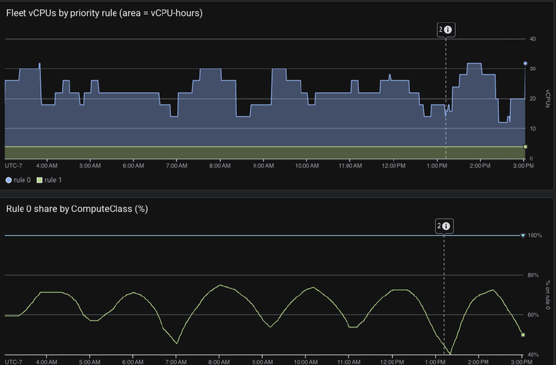
That pair is worth sitting with, because it’s two of the patterns below at once, caught live. The rule 1 band never leaves — it’s thin, it’s steady, and on the stacked chart alone you’d call it noise. The percentage chart underneath is the same data asking a better question, and it swings from 78% down to 40% and back on a clean daily cycle. Nothing was broken either time.
- A persistent fallback band — your first-choice shape isn’t reliably available in that region. Either the preference is aspirational and should be re-ranked, or the rule needs more zones.
- A fallback band that shows up at the same time every day — that’s contention, not scarcity. It’s a reservation conversation, not a rule-ordering conversation.
- Anything in the sentinel tile.
ccc_no_rule_matchingmeans nodes were provisioned that match none of your rules.ccc_scale_up_anywaymeans every rule was exhausted and GKE fell back to a generic shape instead. Both mean the class has stopped describing reality, and both are easy to miss because the workload is running fine. - A
pending_annotationband that doesn’t drain within a minute or so — the exporter has lost visibility. Checkccc_exporter_up.
The failure mode this is really built to catch is the boring one. Not the outage — you’ll hear about the outage. It’s the class that has been quietly serving 60% of its capacity from rule 2 for three months because the rule 0 shape stopped being available in that region and nothing anywhere was designed to tell you.
Get it#
The whole thing is in the examples repo under
priority-fulfillment:
the exporter manifest, five importable dashboards, and a demo class and workload for
generating traffic across more than one rule.
| Dashboard | Scope |
|---|---|
dashboard.json | One class in detail, with separate vCPU, GPU-chip and TPU-chip charts. The debugging view. |
dashboard-fleet.json | Every class and every cluster, by vCPU — per-class cost attribution and rule-0 share. The screenshots above are from this one. |
dashboard-fleet-gpu.json, dashboard-fleet-tpu.json | The same cut, counted in GPU or TPU chips instead of vCPU. |
dashboard-health.json | Scale-up health for one cluster right now: unschedulable pods, provisions per rule, fallback pressure. |
kubectl apply -f exporter.yaml
gcloud monitoring dashboards create --config-from-file=dashboard.json --project <project-id>
install-dashboards.sh imports all five at once. make-fleet-variants.py regenerates the
accelerator cuts from the vCPU dashboard, so if you restyle the fleet view you change it in
one place instead of three.
Everything here was validated live on GKE 1.36.4-gke.1391000 rather than by dry-run —
the exporter ran, Managed Prometheus ingested it, and every dashboard query was executed
against the live API.
Sharp edges#
Collected here rather than sprinkled through the build, so you can read them once and know where the bodies are.
Audit logs can’t answer this, and the reason is worth knowing#
My first instinct was that this needs no new moving parts. The annotation is written to the node object, node writes go to Cloud Audit Logs, and Cloud Monitoring will happily build a log-based metric over an audit-log filter. No exporter, no scrape config, no container to run. Just a filter and a counter.
It doesn’t work, for two separate reasons.
The annotation isn’t there when the node is created. The obvious filter is
io.k8s.core.v1.nodes.create, and it returns nothing useful, because GKE stamps
ccc_priority_index on after the node object exists, as a separate patch. I measured it
on real scale-ups by diffing each node’s creation timestamp against the audit entry for
the annotation write: 57 and 62 seconds. Just under a minute, during which the node is
Ready and already running pods. (This is also an erratum in my last post and in the
examples repo, both now corrected — I had the nodes.create filter in there, and it was
wrong.)
Filtering on the patch instead double-counts. Move the filter to
nodes.patch/nodes.update and you do find the annotation — but a single node’s
annotation write can surface in both methods. My first tally read 17 provisioning events
for 8 actual nodes. A little over 2x, which is exactly the kind of error that looks
plausible enough to ship.
You can work around the second problem by counting distinct protoPayload.resourceName
values rather than log entries. You can’t work around the first one, and neither fixes the
deeper issue: audit logs give you events, and the question is about capacity over
time. Hence a small exporter.
avg_over_time will lie to you about a young series#
It’s worth being clear about what the volume query measures, because I got it wrong first.
The intuitive form is avg_over_time(...[24h]) * 24, and it’s a trap: avg_over_time
averages only the samples that actually exist, so on a series younger than the window you
average over an hour of data and then confidently multiply by 24. My first version
reported 192 vCPU-hours for a series that had been alive for about four minutes.
The sum_over_time form treats absent samples as zero, so it reports observed
capacity-time, and a young or gappy series understates rather than inflates. Understating
is the right direction for a number you might put in a capacity plan.
There’s no backfill#
The exporter reads the nodes that exist right now, so the clock on your historical view
starts the day you deploy it — which is a decent argument for deploying it before you need
it rather than after. And it does need the annotation: on a cluster older than 1.33 the
ccc_priority_annotation_supported gauge reports 0 and the charts stay empty, rather than
quietly reporting zeros as though they were measurements.
There’s a reason I’m publishing an exporter and a JSON file rather than just pointing you at a built-in chart. The intent is to fold this into the GKE dashboards in Cloud Monitoring so it’s there out of the box — nothing to deploy, nothing to import. But the version worth building in is the one that answers the question you’d actually ask, and the evidence for what that question is currently comes from a handful of fleets I’ve run this against. Shipping it built-in first and learning that afterwards is the wrong order.
So if you build on this, I’d genuinely like to know what you find — particularly if the shapes on your chart don’t match the four patterns above, if vCPU-time turns out to be the wrong scale for the way your fleet is shaped, or if there’s a cut of this data that would have answered a question you actually had. Leave it in the comments or open an issue on the examples repo. That’s what shapes what lands next, and in this case what lands built-in.